Thursday, January 16, 2014

Rising from the ashes…

Comes a new me. Yes, I am back. Not that anyone noticed but I return with new aspirations and something I haven’t had in quite a while.

Hope.

Peace.

Joy.

After a lot of heartache and trials, I’ve decided to truly lean on Him. I don’t know what He has in store for me, but I know I won’t be alone.

I am no longer a graphic design major. And I won’t say what I’m now studying or much detail. I can say that I’m waiting. It’s been such a long and arduous journey that I’ve grown quite a bit.

Does this mean I will no longer use any skills that I learned previously? No. God can use them if He wants and I can use them for fun. I should also probably now show what I’ve done before.

Here’s my candy packages that I did my sophomore year. Each had to be a different flavor and I planned on the folded boxes creating 2/3 of a circle from above.


And then there's the new logo! I'm so glad with how it turned out. I’ve made a couple of changes to the previous one and I think it shows how much I have progressed in my tastes. Cartoony beginning, mature negative space, playful and colorful, and now straightened up.


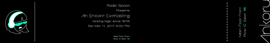
So now my new banner is up and ready! Its supposed to be a ticket to a live screening/recording of the podcast I’ve always dreamed of. It might become real in the future and then I’ll tell you the meaning behind the name. And if you’re wondering, the dates and numbers have no significance. Did I mention that the banner at the top is a bit distorted/blurry. Yeah I tried to fix that but its the best I can do within the size limit. But here's the original banner and the stub for you to keep if the podcast ever happens.


Friday, May 10, 2013

Growing Pains

Really is an appropriate title for what I('m) went/going through.

Well I haven't been feeling well since I came back. But I'll keep my word and show the only art assignments I've done this semester. My only art class was Modern Publication I, the class we take after Intro. to Modern Publication (same teacher too). We had to make a magazine but it was divided into different assignments: the logo, cover, contents page and all of that plus feature and department articles put together in an eight page booklet.

My category was Garden, but I decided to make it a bit interesting and put a prepper/urban twist to it. The name of my magazine is Growing Pains but unfortunately some people didn't get the joke.

Logo

Cover

Contents Page

Feature Article

Feature Article (continued) / Department Article

Back Cover

I decided not to fix some of the mistakes such as tighter kerning, the three subheads I forgot to put in, and the price. I'm too tired and sick to do that. Unfortunately for the last assignment I turned in the booklet late. So what would have been an A- turned into a B- project. Oh well, I learned not to do that again. Maybe later I'll tell the funny story that went along with this project.

I used the fonts Alba Matter, Duality, Dead Kansas, Dead Secretary, and Death Font. I mostly used photos from foter, tumblr, and national geographic. The front cover was a tracing of graffiti from foter.

Other than that, you can see the revised logo I made on the back cover of the magazine. I really like it. I was supposed to use the back as a nameplate with class section and name. A lot of people went the extra mile, but I wanted to add my logo just to put my name out there. Surprisingly my teacher said it was a nice logo. I'll explain more about the logo in the next post.

Thursday, May 9, 2013

Finally Home

Well my earthly home that is.

The rest of my travels went surprisingly well and I realized I had changed. I no longer see my home as the dazzling bright city; it looked dull and not as bright and lively. I knew I changed and I see now what actually matters. And for the third time in my life, I felt like an adult.

Now I'm really sleepy, so I'm going to regain all the sleep I lost in college. I may post something by Friday.

Wednesday, May 8, 2013

Almost Home

I'm at the airport right now, but I wanted to say that I'm coming back changed. Plus a bit of information.

A couple of hours ago my friends graduated, I cried, she cried, and I wish this chapter in my life didn't have to end. I was greatly saddened at the fact that my friends have to leave me behind. I couldn't have passed my sophomore and junior year without them to comfort me, teach me, and laugh with me.

Of course I'll keep in touch, but I fear what my senior year will be like without them. But I know I have to use what I have been taught and be put to the test. I have learned so many things.

I learned how to be a better friend, be a comfort to others, control my temper and words, and that I need to love people and open up more.

Academically, I need to not do things half-heartedly and instead be diligent and hardworking. And most of all ... need to lean and trust fully in God.

He's made it clear with me a lot of things this year. I won't go into detail but I can say it was funny for my friends to watch.

Now for some upcoming updates.

I'll be uploading some projects I've done in one of my graphic design classes. There's a funny story how this project is involved in a deal I made with the Lord. But that's for another time.

Along with these projects will be the revised logo for this blog and possibly will be used in my (Lord-willing) upcoming artshow.

That's it for now. I've been waiting at the airport for (about) 4 hours and will need to wait 3 more for my first flight. And getting my luggage checked in was a big hassle, not to mention just packing it before leaving campus. Just gotta hang in there.

Saturday, January 19, 2013

Leaving Again...

But as a new person.

In a few hours I have to leave my home for college. It never gets any easier but its obvious now that God wants me to go back to college. He made sure no one would stop me from going back. It hurts but I realized that God wants me to do something very difficult.

Love.

I have to show the love He's shown me to others. It will be very difficult, especially in a world that doesn't want it. But I must.

I will be back in a few months. 'Til then, pray for me.

Sunday, December 23, 2012

Dorisa Will Take A While

This is the class that involves the story from my previous post about my hymnbook cover. For my Intro. to Modern Publication class we were supposed to create a series of direct mail items for a company/service of our choosing. Our company or service can be made up or a real (actual logo can be changed) and we had to use that same company/service throughout the semester in every project. I tried to continue my Pokemon direct mail sales letter from my Copy Writing class but my teacher said 'no'.

So after a couple of minutes of being depressed I decided I wanted to do my series of direct mail on a made-hotel from my script. Before I was kicked out of Media Productions I took Broadcast Writing. One of my scripts became a whole story (not-yet-told) and there was a hotel I made up called the Belvedere Hotel. One of my upcoming events for the Belvedere Hotel was the grand opening of their restaurant/lounge named Dorsia. Yep I never forgot about Dorsia.

Front (you may notice that I used some images from LA Noire)
He said that I had a good headline and a very nice design. I just need to change the contrast to work with the logotext.
I also need to cover up Elsa for my portfolio/artshow.

Back (I deleted some unnecessary text and fixed a spelling mistake)
He also said the back had a very nice design.

To keep up with the 1940s theme for my script I made the design use black and white with a dark red gradient as the main background. To add a bit of elegance and class I put a damask pattern in the background. The symbol I used in my logo was actually made in my Graphic Design class for a previous project and then I added the rest of the words later.

My Graphic Design teacher thought this looked pretty good.

The font I used for the symbol and logo was Andes. For my copy I used Caviar and sometimes Champagne & Limousines, although that would mostly be seen in the rest of my direct mail series. I'm only showing my postcard project because this was my strongest project and I could have gotten an A- if I wasn't a day late. It wasn't my fault the printer wouldn't print out my project. I'm not bitter >:(

Stupid B-

Saturday, December 22, 2012

Soylent Green

IS PEOPLE!!!!!!

        I just had to do that. Soylent Green has become infamously synonymous with my name among my friends and teachers at college. They all know it and have tried to stop my plans that involve it. It is unfortunate that only my mentor understands the humor I see in it. After three tries (or maybe four) of trying to do a Soylent Green project in any of my classes, I was finally successful. I was able to make a Soylent Green-like project for my Professional Selling class. My teacher had enough trust in me to make this. He doesn't know what Soylent Green is; I plan on telling him after my graduation.

       For this project we had to make a sales letter, but I had already done one in my Copy Writing class. However that one was for Pokemon, my teacher later regretted allowing me to do it on Pokemon. This class was a business class but our teacher understood that half of the class were Graphic Design majors. So he said we could design it and that the more realistic it was would give us a step up.

       I would have gotten a 96 on this project but it was late. My grade for it went down to an 86 for being a day late. He gave some pretty positive feedback on it – had a good opener, good testimonials, clear benefits, and a nice brochure. He also said I was a good writer and that my sales letter was really good. Too bad I'll have to explain what Soylent Green is after I graduate. Imagine his face ^-^

The font I used for the letter was Baskerville and Luna Bar for the logo.

Unfortunately this and the finished printed product are difference in color.
For some reason InDesign wouldn't give me the same color I had for my logo.

Had a lot of fun making the slogan. Again, only my mentor thought it was funny.
I originally made two versions of the symbol. This one seemed more like an energy supplement for those people who work out. A lot. The one I chose seemed health-foody and "all natural".

Due to my lack of knowledge and time, I was unable to make an envelope for my sales letter.
This would have been the envelope I was going to turn in. (This SO doesn't look like Nookington's)

Even though he said I had a nice brochure I refuse to show it. It may be nice to him but he does not specialize in design. My art teachers would give me quite the critique if I showed them my Soylent Green brochure. I do like the alternative version of my Soylent Green logo so I might redo it in the future.

And yes, I do have too much fun with my projects. I use funny names and weird addresses – one address is at some cafe called Jo Mamma's or something and the other is My Mom's bakery something. Yeah, I like Regular Show. It's awesome.