Showing posts with label Class Project. Show all posts

Thursday, January 16, 2014

Rising from the ashes…

Comes a new me. Yes, I am back. Not that anyone noticed but I return with new aspirations and something I haven’t had in quite a while.

Hope.

Peace.

Joy.

After a lot of heartache and trials, I’ve decided to truly lean on Him. I don’t know what He has in store for me, but I know I won’t be alone.

I am no longer a graphic design major. And I won’t say what I’m now studying or much detail. I can say that I’m waiting. It’s been such a long and arduous journey that I’ve grown quite a bit.

Does this mean I will no longer use any skills that I learned previously? No. God can use them if He wants and I can use them for fun. I should also probably now show what I’ve done before.

Here’s my candy packages that I did my sophomore year. Each had to be a different flavor and I planned on the folded boxes creating 2/3 of a circle from above.


And then there's the new logo! I'm so glad with how it turned out. I’ve made a couple of changes to the previous one and I think it shows how much I have progressed in my tastes. Cartoony beginning, mature negative space, playful and colorful, and now straightened up.


So now my new banner is up and ready! Its supposed to be a ticket to a live screening/recording of the podcast I’ve always dreamed of. It might become real in the future and then I’ll tell you the meaning behind the name. And if you’re wondering, the dates and numbers have no significance. Did I mention that the banner at the top is a bit distorted/blurry. Yeah I tried to fix that but its the best I can do within the size limit. But here's the original banner and the stub for you to keep if the podcast ever happens.


Friday, May 10, 2013

Growing Pains

Really is an appropriate title for what I('m) went/going through.

Well I haven't been feeling well since I came back. But I'll keep my word and show the only art assignments I've done this semester. My only art class was Modern Publication I, the class we take after Intro. to Modern Publication (same teacher too). We had to make a magazine but it was divided into different assignments: the logo, cover, contents page and all of that plus feature and department articles put together in an eight page booklet.

My category was Garden, but I decided to make it a bit interesting and put a prepper/urban twist to it. The name of my magazine is Growing Pains but unfortunately some people didn't get the joke.

Logo

Cover

Contents Page

Feature Article

Feature Article (continued) / Department Article

Back Cover

I decided not to fix some of the mistakes such as tighter kerning, the three subheads I forgot to put in, and the price. I'm too tired and sick to do that. Unfortunately for the last assignment I turned in the booklet late. So what would have been an A- turned into a B- project. Oh well, I learned not to do that again. Maybe later I'll tell the funny story that went along with this project.

I used the fonts Alba Matter, Duality, Dead Kansas, Dead Secretary, and Death Font. I mostly used photos from foter, tumblr, and national geographic. The front cover was a tracing of graffiti from foter.

Other than that, you can see the revised logo I made on the back cover of the magazine. I really like it. I was supposed to use the back as a nameplate with class section and name. A lot of people went the extra mile, but I wanted to add my logo just to put my name out there. Surprisingly my teacher said it was a nice logo. I'll explain more about the logo in the next post.

Sunday, December 23, 2012

Dorisa Will Take A While

This is the class that involves the story from my previous post about my hymnbook cover. For my Intro. to Modern Publication class we were supposed to create a series of direct mail items for a company/service of our choosing. Our company or service can be made up or a real (actual logo can be changed) and we had to use that same company/service throughout the semester in every project. I tried to continue my Pokemon direct mail sales letter from my Copy Writing class but my teacher said 'no'.

So after a couple of minutes of being depressed I decided I wanted to do my series of direct mail on a made-hotel from my script. Before I was kicked out of Media Productions I took Broadcast Writing. One of my scripts became a whole story (not-yet-told) and there was a hotel I made up called the Belvedere Hotel. One of my upcoming events for the Belvedere Hotel was the grand opening of their restaurant/lounge named Dorsia. Yep I never forgot about Dorsia.

Front (you may notice that I used some images from LA Noire)
He said that I had a good headline and a very nice design. I just need to change the contrast to work with the logotext.
I also need to cover up Elsa for my portfolio/artshow.

Back (I deleted some unnecessary text and fixed a spelling mistake)
He also said the back had a very nice design.

To keep up with the 1940s theme for my script I made the design use black and white with a dark red gradient as the main background. To add a bit of elegance and class I put a damask pattern in the background. The symbol I used in my logo was actually made in my Graphic Design class for a previous project and then I added the rest of the words later.

My Graphic Design teacher thought this looked pretty good.

The font I used for the symbol and logo was Andes. For my copy I used Caviar and sometimes Champagne & Limousines, although that would mostly be seen in the rest of my direct mail series. I'm only showing my postcard project because this was my strongest project and I could have gotten an A- if I wasn't a day late. It wasn't my fault the printer wouldn't print out my project. I'm not bitter >:(

Stupid B-

Saturday, December 22, 2012

Soylent Green

IS PEOPLE!!!!!!

        I just had to do that. Soylent Green has become infamously synonymous with my name among my friends and teachers at college. They all know it and have tried to stop my plans that involve it. It is unfortunate that only my mentor understands the humor I see in it. After three tries (or maybe four) of trying to do a Soylent Green project in any of my classes, I was finally successful. I was able to make a Soylent Green-like project for my Professional Selling class. My teacher had enough trust in me to make this. He doesn't know what Soylent Green is; I plan on telling him after my graduation.

       For this project we had to make a sales letter, but I had already done one in my Copy Writing class. However that one was for Pokemon, my teacher later regretted allowing me to do it on Pokemon. This class was a business class but our teacher understood that half of the class were Graphic Design majors. So he said we could design it and that the more realistic it was would give us a step up.

       I would have gotten a 96 on this project but it was late. My grade for it went down to an 86 for being a day late. He gave some pretty positive feedback on it – had a good opener, good testimonials, clear benefits, and a nice brochure. He also said I was a good writer and that my sales letter was really good. Too bad I'll have to explain what Soylent Green is after I graduate. Imagine his face ^-^

The font I used for the letter was Baskerville and Luna Bar for the logo.

Unfortunately this and the finished printed product are difference in color.
For some reason InDesign wouldn't give me the same color I had for my logo.

Had a lot of fun making the slogan. Again, only my mentor thought it was funny.
I originally made two versions of the symbol. This one seemed more like an energy supplement for those people who work out. A lot. The one I chose seemed health-foody and "all natural".

Due to my lack of knowledge and time, I was unable to make an envelope for my sales letter.
This would have been the envelope I was going to turn in. (This SO doesn't look like Nookington's)

Even though he said I had a nice brochure I refuse to show it. It may be nice to him but he does not specialize in design. My art teachers would give me quite the critique if I showed them my Soylent Green brochure. I do like the alternative version of my Soylent Green logo so I might redo it in the future.

And yes, I do have too much fun with my projects. I use funny names and weird addresses – one address is at some cafe called Jo Mamma's or something and the other is My Mom's bakery something. Yeah, I like Regular Show. It's awesome.

Friday, December 21, 2012

Of Smugness and Teachers


       For this project we had to make a hymnbook. Unlike the previous projects (i.e. magazine grid) we were able to use color and any other fundamentals of design that we've learned in this project. I decided to make a children's hymnbook using this cute picture I found on National Geographic. As you may tell by now, National Geographic is one of the few places we are able to get pictures while in college. Now we are able to leave campus with our laptops but its easier said than done. The place where I got my internet off campus had become popular. This made the internet slower thus less time to find what I need and use the internet for entertainment purposes. You have no idea how much Failblog has helped me in the semester.

Funny story: My graphic design teacher had this project in his project pile while he was cleaning up to leave the classroom. He had to clean up so that the next class can use that room and the teacher for the next class can use the desk. I was in the next class (Intro. to Modern Publications), which meant the next teacher was also my teacher. Unfortunately while my graphic design teacher was cleaning, my Intro. to Modern Pub(lications) teacher saw the pile and made some funny comment at my project. My graphic design teacher whispered to him and they both looked at me. I hated the smug smile my Intro. to Modern Pub teacher showed. Why am I telling you this? An upcoming project will have to do with that teacher for Intro. to Modern Pub.

Thursday, December 20, 2012

Order Within Grids


       For this project in class we had to use a grid for a magazine article. The article had to come from Answers In Genesis and must have followed a grid. Mine was much more simple than the others but I got an A for it. It was late but thankful my teacher saw that it wasn't my computer's fault. After a while we were able to print it out and get me my A. It's a simple design; one picture that being used as the background and using a two column layout for the article. I used a picture I found on National Geographic that was already upside down and turned it back to normal view. Then I made a black gradient on the bottom side of the picture where a huge puddle and reflection showed. This made the article legible with its white type. And that was it.

Unfortunately I had to upload this as a JPEG instead of a PDF so don't mind how compressed it looks. I'm a bit under the weather so I'll upload my other projects later. But what do you care, I rarely upload. And it seems my GracieGrace identity suite is the only project that anyone cares about. Oh well.

Saturday, June 23, 2012

Forced Project #1

I honestly don't want to remember those graphic design classes again. But the majority of my posts this summer will involve a project I did in my second semester graphic design class. This project was a two-part identity suite: one business and one personal. I'm thinking of redo-ing my personal identity suite, but in the meantime I'll show my business one.


I made a fake clothing business called Black Tea. Serving the rich and posh with glamorous and fancy clothing. Or something like that. When I was starting on this project I knew I wanted something like Aquaberry, the fictional clothing brand from Bully. But I mostly made my business resemble Burberry, maybe I'll make something for Aquaberry in the future. It took me a long process to finally make my logo, but I like how it turned out in the end.

The picture above shows the envelope, the (front) business card, and the logo itself. I also had a letterhead for Black Tea, but I don't like how it turned out. I seem to have trouble with letterheads. I made a grey tartan pattern for the background/theme to resemble the Burberry tartan pattern, and used a cranberry color as complimentary/secondary color. I think it looks kind of cool. Now that I'm thinking about cranberry, I may use that later for another project.

Next time I'll have a new logo to show you and hopefully a new banner/background.

Tuesday, December 20, 2011

Mah Skillz in College

Yeah, I didn't have time to post yesterday. I was too busy watching funny videos and Toy Story 2. But enough about that! Here's one of two of the best projects I've done (which means these were the only ones that were graded the highest, a B). Yeah its pathetic but at least I tried.


Yep, this one actually got me the highest grade I've ever gotten in this class. I did some changes that the teacher wrote down to make it better. I changed some of the kerning and made "Includes" in smaller font. Another change was removing my name, for obvious reasons. Who would want to buy a hymnbook from a mental frog?

The theme of our hymnbook had to be from a particular hymn that we chose as our main song. I chose "I Believe In Miracles", my favorite hymn, and then include three other hymns. Since the theme was Miracles, I chose the aurora borealis as my background. I still can't understand how people don't realize God's hand in nature and everything else. The font I used was Noir-et-Blanc for the title and I forgot which font I used in the subheading. I'm not sure if I'll post the next project that I did in college since I would have to censor a lot of things. Not that it has bad content, but for privacy reasons. This mental frog needs to be secluded from the rest of the world.

Wednesday, August 17, 2011

Drawings, Failings, and Blessings

Okay, so here are the drawings from college and their original pictures. Our class was assigned to draw a human (a portrait), and to be honest, I hated being in that class. Keep in mind that graphic design doesn't really involve drawing aside from quick sketches to perfect on a computer. Of course, this isn't as good as the original, but I really did try and never got it right. And remember that I can't scan these since they're too large for my scanner and I can only take bad uneven photos of them.

I couldn't find the original photo from deviantart, so I had to take a picture of the one I printed out. You can see the measurements I made on it. Another thing that leads to my distaste of the rules is the limited access to internet. Which means not being able to see images and thus making it VERY difficult to find sources to draw from. Luckily, my suitemate was able to provide a picture since she's taken a similar class before. I should probably stock up on pictures before I go back.

I'm very proud of this drawing, even though I got a lower grade than the one above. I really was heart-broken when I got my grade back since I honestly did try and actually liked the source. Oh well, no use crying over spilt milk.

The original is from National Geographic.


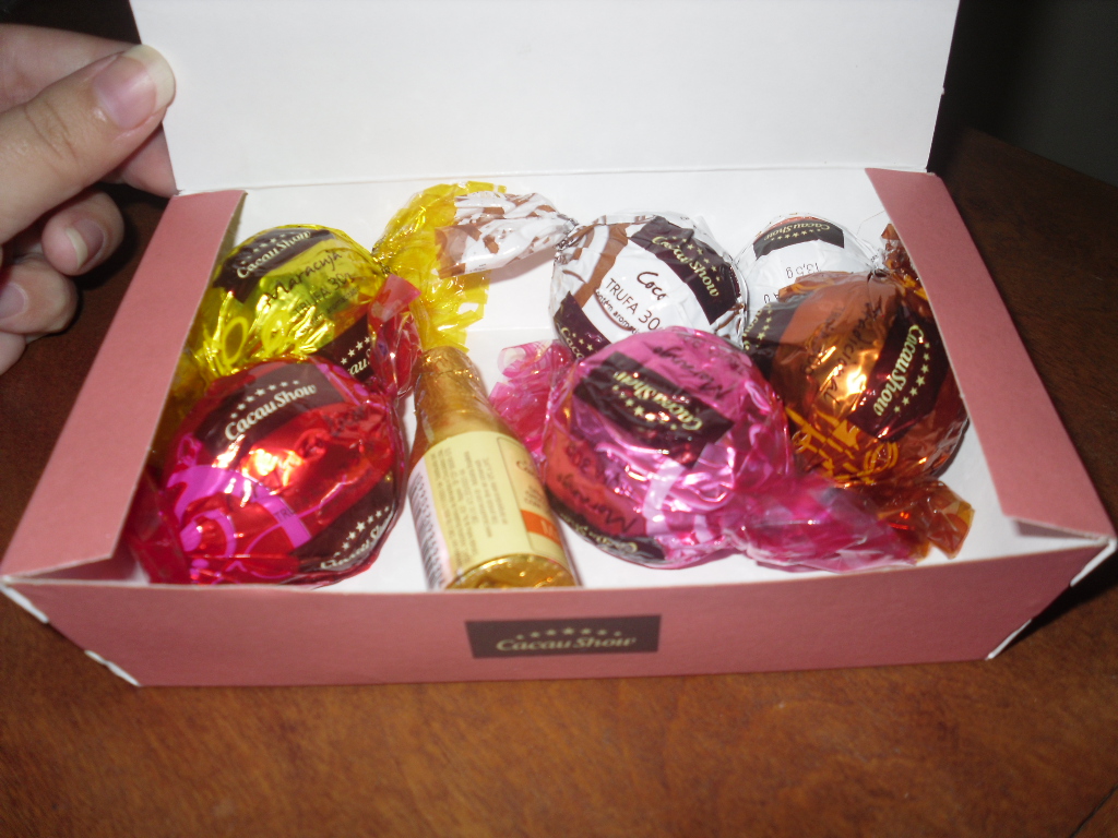
Weight Challenge Progress: A losing battle. And I mostly blame my mother, the audacity of the her to bring my favorite pizza and Brazilian chocolates when I should be exercising like crazy and watching what I eat. So far I fear I may never lose weight before I leave if things continue like this. But I shouldn't complain, my mother knows I can't have good pizza at college and the chocolates were a gift from someone who came back from Brazil. Okay, this will be the last time to indulge.

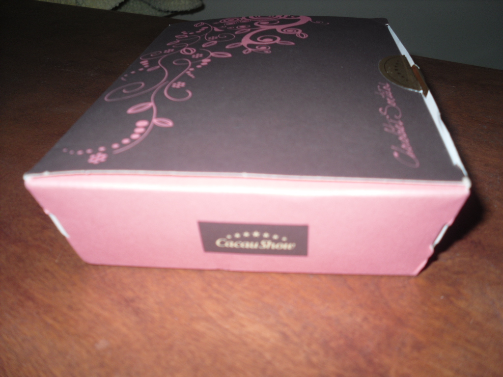
I thought the box and chocolate wrappings were pretty, so I took some pictures to show one of the many blessings God has shown upon me. God is still good to me.

Simplicity is a sign of perfection. I like to keep to that principle.

Try explaining the importance of font to non-art students. 

I love pink ^_~ 

Holy smokes! A frog with a human hand!


Now if you'll excuse me, I'm going to eat my share of the chocolates. Oh snap! More inspiration!

Saturday, July 9, 2011

Still Alive

To the dismay of many around me. Yes I'm not dead, just back from college.

Actually, I've been home since mid-May but a lot has happened since then. I was very depressed and had constant nightmares of going back to college. The thing is: my college is on the other side of the country. And I always feared that I would never do all the things I wanted to do before going back. Why is that important? Because my college is also VERY strict, and I'm scared of losing the freedom I have here. But a friend has helped calmed down those fears.

I also feel bad for never emailing my old teachers and acquaintances. The blame belongs to the very same college I'm fearful of. As said before, the school is strict and I have limited access to internet. Not being able to use my own email and not being able to update my blog. But wait there's more!

First semester was terrible, I've had to start all over with Graphic Design (learning just the basics), lose inspiration, and even lose the love I had for Graphic Design. I really want to bring that back into my life. This is something I have to pray about.

But all is not lost. Second semester was when I finally smiled during school. That may seem unimportant, but keep in mind: first semester was REALLY BAD. I won't give all the details except for the fact that I smiled more often.

Might as well show the only graphic design projects I've done in college (aside from class projects).

My mother sent me a picture of my younger self. My job was to get rid of the glue marks (evil popsicle-stick frame), pen scribbles, and marker... marks. Of course I covered my ugly mug with the Laughing Man logo to save everyone from the horror that is me. But my mom was very pleased from the restoration. Wish I could show you how bad the original was.

I can't believe how many years have gone by since this picture was taken. And now I'm no longer the happy-go-lucky kid I used to be. After watching over pre-schoolers in Bible Vacation School, I wish I could tell them to never take this time for granted. But they probably wouldn't understand, and it might be best that they don't know what's ahead of them.

Come on, don't start getting sentimental now.

This entry was for a contest all Graphic Design majors had to participate in. A lot of things went wrong during this project. Lack of inspiration, upcoming deadline, and an overexposed photograph. I took the picture of my lovely model the night before the deadline and worked on it the day of the actual deadline. Not my fault for a lack of inspiration.

Since the photo was over-exposed to the point where I couldn't fix it in time, I decided to just outline my model's face. By the way, that lovely outline belongs to my old roommate who took the time to put her hair up and have many pictures taken of her. I messed up the outline by trying to make the lines sharper and less blurry. But instead they became pixelated. It only took me twenty minutes in total to make the outline, the background, it's gradient, and the oval pearl necklace. Yeah, not much.

Wednesday, June 16, 2010

Old SkooL

Well, kind of...
I went back to what started graphic design for me, Illustrator. I outlined a picture of a phoenix using the pen tool and filled in certain parts with black or white. Then I used a flame font of sorts to make the flames (duh) on the Los Inmortales part at the bottom.

This was for my class' senior awards night booklet. Ironically, I didn't go.

Because I wasn't invited to get an award.

But apparently I did get an award. Two of them.

No one told me. *sob*

I got them the next day. No applause for me...*sob*

Tuesday, June 8, 2010

Even farther than before

This has gone too far.
An ugly cover, a bad model, too much going on in the background, illegible words, bland teasers (randomly choosing a country) and headlines, it has everything you don't want. I might have had an easier time with this if I used a different model, particularly not a real human model.

In a nutshell I used a lot of blend modes in the layers palette, particularly color dodge, then I used brushes along side from what I learned about glowing ribbons and I used masking for the pictures. This of course is not my best but what else could I do. Maybe later on if I get a better picture and more time, I could do this again. My inspiration has seemed to be Ghost In The Shell for a while. At first I tried to make a grid on the face but I gave up on that idea the last minute and started using brushes. It didn't come out as I wanted but I still got some interesting reactions, even if some were trying to be nice. By the way, I'm not used to having pictures taken of me so I can't smile by force. Well that and I never look good.
It's pretty obvious what our objective was but I'll say it anyway. Our objective was to create a magazine cover with us (in ten years) being the main point and why we were on the cover. This is rather pathetic for me ...or about me.

Thursday, May 27, 2010

Went a bit too far

Okay, this is probably one of my favorite things I learned about in Photoshop. Adjustment layers. Really, that's all you need to put make-up on someone. I used it for the eye shadow, the eyes, lips and the rest of her face. I also used the pen tool to make the markings and used the brush tool to make those flowers. After that I used some effects to make the flowers and markings glow. Unfortunately I had some difficulty making her face softer. I first got rid of all the spots on her face and the glow to make her look a tiny bit better. After that, I then got crazy and made her face weird. I love how I made her look. Only problem that I'm displeased with is that weird blue line on the top of the picture. Weird.

Worst Project I've Ever Done

I can't emphasize how horrible this project was to me. Usually I would get some little idea on how to do a project and what it would look like, but I had really tough time with this. I never thought I would get a writers block or something of that kind. It really brought my whole week down and I can't bare to remember it again, so I'll leave it at that.

Does it look authentic?

This one was a bit more difficult than our previous Photoshop projects. Adding from what we learned about repairing photos, we also had to color in objects and make it look authentic (and natural) as possible. We learned about adjustment layers, saving selections and loading them and it wasn't really difficult. This project took us longer than the others since some of the students forgot that they could brush over the other objects and subtract them after loading a selection.

Those eyes...

This time we were learning how to repair an old photograph using an effect called 'Dust and Scratches' and the Clone Stamp tool. We also had to use screenshots in the History pallet while using Dust and Scratches and make sure we didn't leave a certain screenshot. Unfortunately if we didn't follow those exact directions we would have to start all over. The original is on the left and the fixed one is on the right again. I first got rid of the dust and scratches marks and used the clone stamp tool to get rid of the tape. Some of the dust and scratch marks aren't very noticeable, especially on the clothes. Although I still should have seen that something was wrong with that little girl's eyes.

Making people look a bit "better"

Now comes the fun part of Photoshop, messing with people's faces'. Well in this case it's making this guy look better. I used the spot healing brush, burn tool, and plain ol' healing brush. The original is on the left and the fixed one is on the right. If you can't tell the difference it's his wrinkles, his teeth and blemishes. His wrinkles and blemishes are less noticeable and his teeth have been whiten. Still not much? Well the next post should be better.

Best Work

This is most likely my favorite project that I'll ever do in Photoshop. Don't mind the cut-off borders, it was supposed to be a design for a CD cover. Our objective obviously was to create a CD cover front (left) and back (right). It could be anything you want: fake or real artist, video game soundtrack, DVD anything! For once I had creativity and I'm really proud of this project. In this project I utilized the extra tricks I learned from tutorials before anyone in my class learned them.

Here are all the tools I used: patch, gradient, lasso and wand, clone stamp, pen, quickmask, brush, type, adjustment layers and changing the blend modes. From what I can remember I used five different pictures in the front cover and four in the back.

I had a lot of inspiration for this one. The CD title is based on the nightclub in GTA:III, the Planetarium, hosted by Andre the Accelerator on Rise FM. Since the radio station plays house/electronic dance music I thought using Ghost In The Shell: SAC would be more appropriate to use. The majority of the pictures used were from the anime, in fact one picture is used as the whole back cover with only three added pictures (one being the Major, Lain from Serial Experiments Lain and Tsukiko from Paranoia Agent). The only thing not anime related was the picture of the turntables.

For the front cover I used a picture of a city (which you can't really see) and changed it to blue. I also added a rain effect I learned using brushes from a tutorial. Then I added a picture and changed it to blue and changed the blend mode and opacity. For more effect I used the clone stamp tool and added extra screens. After that I took a picture of Major Kusanagi, cut out the rest of the background, made her look like a hologram (also from tutorials) and used gradient for the bottom of the hologram. The same goes for the hands and turntables. I wanted to make the title look like the supposed holograms around the Major in a circular kind of way. This is the closest I got to but I'm ok with it. Unfortunately the DJ part at the bottom doesn't get much attention.

At last the back cover which was just the original picture changed to blue. The three main screens are cut out pictures of the female characters, changed them to blue and put them into the original background of Major Kusanagi. Since we had to have a least 10 songs (or whatever) I put in the soundtrack (only 5 songs) from Rise FM and made up the rest of the songs. I added a little something extra by making the song holders into small screens like the ones above it using the pen tool. Since I didn't like the uneven layout of 10 songs I decided to make the 10th song a bonus track and used the smaller blue screen to hold it. The last parts were making the spines for the CD, as you can see the title for both sides and cloned some part of the back cover for the spines. Then I used used the gradient tool at the bottom of the cover since I wanted the song names to be more noticeable. Finally I typed out Bonus Track in an arch over the main screen. Again this was probably my favorite project using Photoshop. I hope in the future I'll have just as much creativity or inspiration as this one.

More postcards?

Just for now. Our objective was to extract an object from a picture using the wand tool or lasso tool. We had to find everyday items (commodities) that set up a culture. My theme was Japan even though I don't actually know much about Japan. It's simple and unoriginal. I wish I could say its because we hadn't learned much about Photoshop at this point but I know it still wouldn't make a difference.

Yay?

We finally reached the Photoshop stage and look what I have to show you! Yeah not much, but hopefully it will get much better. Our objective was to use the canvas tool and change the resolution. It was kind of hard to make it look like a post card using the canvas tool but after that it got easier. Again not much.